Thinking design is just a matter of your e-commerce site ‘looking pretty’ is a grave mistake that leads to unhappy customers and reduced sales. Design is far more than choosing the right background color and some stock images.
A proper design leads to a good user experience (UX), which makes it easier for a customer to use your site and buy merchandise in your e-commerce store.
Our approach to UX design at eTeam is that iterative development and manual testing always beat abstract theory. In practice this means that every e-commerce store or webapp that we create always goes through rigorous manual testing to make sure customers are able to shop with ease. We’ve even put together a report with case studies outlining our findings.
UX isn’t just a pretty design and vice versa
Even designers and developers who ought to know better still confuse UI design with UX design. These two are related, even inseparable, but still distinct. It bears repeating that a site can be breathtakingly beautiful yet still difficult to use. Too many images, videos, chatbots and the latest fad widget make a site impossible to load without the latest computer and a lightning fast connection. This is the epitome of poor UX design.
Design isn’t just about aesthetics. While a well-designed e-commerce store should look nice, user-centered design (UCD) is about using design principles to make an object, store or product easy to use. For an e-commerce site this would include quick load times on any device, the ability to find the items you’re looking for, a simple checkout process and easy to contact customer service.
Signs that your shop has a UX problem
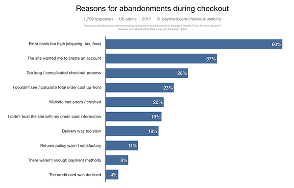
The number one sign that your shop has a UX problem is abandoned carts. If a customer looks through your site, selects items and then leaves, in most cases that means something is off. To give an idea of the scale of this problem, nearly 70% of carts end up abandoned.
Another thing to look out for is whether purchases are exclusively from a single type of device. If nearly all of your purchases come from desktop computers, that should be a red flag that your mobile site has usability issues. While not as common, some sites take the mobile first mantra too far and look awful on larger screens.
The more advanced your analytics are, the easier it is to pinpoint the issue. Do visitors leave after searching without adding an item to their cart? Do people leave within a few seconds of seeing your main landing page? These are all areas for further investigation and possibly manual UX testing.
Creating a user story
Too often sitting down and writing a literal user story gets pooh-poohed by ‘serious’ project managers and designers. This is a major mistake. A good user story is the key to avoiding common UX design flaws in e-commerce sites. Once you’ve created your user story and generated a typical shopper, you can do the appropriate market research to figure out how to create a more user friendly site for your demographic.
Suppose your typical user overwhelming shops on mobile has a strong preference towards using Apple Pay; it’s a no-brainer that you’d choose a mobile-first design framework and select Apple Pay as possible payment method. It’s all too easy for developers and designers to create sites for themselves rather than their users. Shocking though it may be to many, not every user navigates the internet on the latest and greatest laptop with a massive top-of-the-line external display. User stories are the best way to keep this habit in check.
Manual testing checks your assumptions
Once your user story is ready and some analytics are pointing to potential problem areas in your shop, it’s time to run some manual UX tests.
- Find someone who is unfamiliar with your site but within the demographics of your typical user.
- Ask the tester to complete a concrete goal using the same device and configuration as a typical user without any additional help from you. A goal could be to find and purchase three items, join a loyalty program or find specific information.
- Ask the tester to narrate their steps as they carry out their task.
Get ready for designers and e-commerce developers to have meltdowns when they watch these recordings. The good news is that it usually takes only a few tests to identify key problems.
When a tester isn’t able to accomplish their assigned task, analyze where they got lost. This is why narration is an important part of UX testing. If the tester wasn’t able to find your e-commerce store’s return or shipping policy, perhaps you need to make your knowledge base more prominent. Did items disappear from the tester’s shopping cart? Were suggested items displayed? These are all things to check and tweak if need be.
Good intentions…
Many UX issues can be the result of perfectly benevolent intentions that just didn’t quite get implemented correctly. Chatbots are a great communication channel for customers to quickly resolve issues and answer questions. On the other hand, these same chatbots and popups can reduce product visibility or render a site unusable if they aren’t easy to close. Other times, fields or buttons appear off the screen on a phone. That’s why it’s important to test every e-commerce site on a variety of devices.
Logic with just a hint of muse
The way to avoid UX problems in e-commerce or any webapp is to approach UX design as a rigorous science with testable hypotheses. That’s not to deny some artistic flair adds to a site, but a designer’s role goes beyond creating visually appealing websites. A UX tester's role is to use analytics to form hypotheses about where and what is causing shoppers to abandon their shopping carts and then test these ideas. True design just works and is beautiful to boot.
We’ve been designing retail and e-commerce webapps for the better part of a decade at eTeam. We’d love to get in touch and discuss how to optimize the user experience on your site.